Ako nakupovať
Doručenie
Nákupný poradca
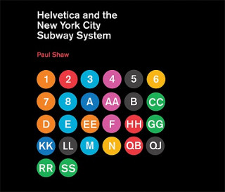
Helvetica and the New York City Subway System
 Angličtina
 106 b
106 b
30 dní na vrátenie tovaru
Zákazníci tiež kúpili


For years, the signs in the New York City subway system were a bewildering hodge-podge of lettering styles, sizes, shapes, materials, colors, and messages. The original mosaics (dating from as early as 1904), displaying a variety of serif and sans serif letters and decorative elements, were supplemented by signs in terracotta and cut stone. Over the years, enamel signs identifying stations and warning riders not to spit, smoke, or cross the tracks were added to the mix. Efforts to untangle this visual mess began in the mid-1960s, when the city transit authority hired the design firm Unimark International to create a clear and consistent sign system. We can see the results today in the white-on-black signs throughout the subway system, displaying station names, directions, and instructions in crisp Helvetica. This book tells the story of how typographic order triumphed over chaos. The process didn't go smoothly or quickly. At one point New York Times architecture writer Paul Goldberger declared that the signs were so confusing one almost wished that they weren't there at all. Legend has it that Helvetica came in and vanquished the competition. Paul Shaw shows that it didn't happen that way--that, in fact, for various reasons (expense, the limitations of the transit authority sign shop), the typeface overhaul of the 1960s began not with Helvetica but with its forebear, Standard (AKA Akzidenz Grotesk). It wasn't until the 1980s and 1990s that Helvetica became ubiquitous. Shaw describes the slow typographic changeover (supplementing his text with more than 250 images--photographs, sketches, type samples, and documents). He places this signage evolution in the context of the history of the New York City subway system, of 1960s transportation signage, of Unimark International, and of Helvetica itself.
Informácie o knihe
Angličtina
Kategórie

Darujte túto knihu ešte dnes
Je to jednoduché
1 Pridajte knihu do košíka a vyberte možnosť doručiť ako darček 2 Obratom Vám zašleme poukaz 3 Knihu zašleme na adresu obdarovanéhoMohlo by vás tiež zaujímať


 /
Brožovaná
/
Brožovaná
 18.32
€
18.32
€